Did you know that you can plot rows in two different ways?
You probably know how to use the standard plot rows button available in GA reports.
Simply select the rows you are interested in and click the plot rows. This is an easy way to decompose an aggregate trend into components. If you have never used this functionality, have a look at my previous post about simple GA tips.

Very often, using this feature gives you an insight into the drivers of any trend.
Unfortunately, it is impossible to remove the aggregate metric from the plots. Because of this, it is sometimes difficult to visualize minor components of the metric.
In these cases, I usually export the data and visualize it with some other tool. Most of the time this is Excel or Google Sheets.
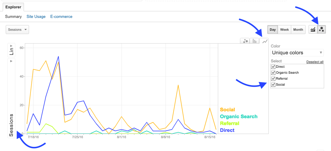
First you need to choose the Motion charts by clicking the icon with small bubbles.
Next choose the time series graph instead of the (mostly useless) motion chart.
Choose the metric to plot (on the left) and the dimensions you are interested in (on the right).
Now we have a nice diagram without the useless aggregate numbers!
